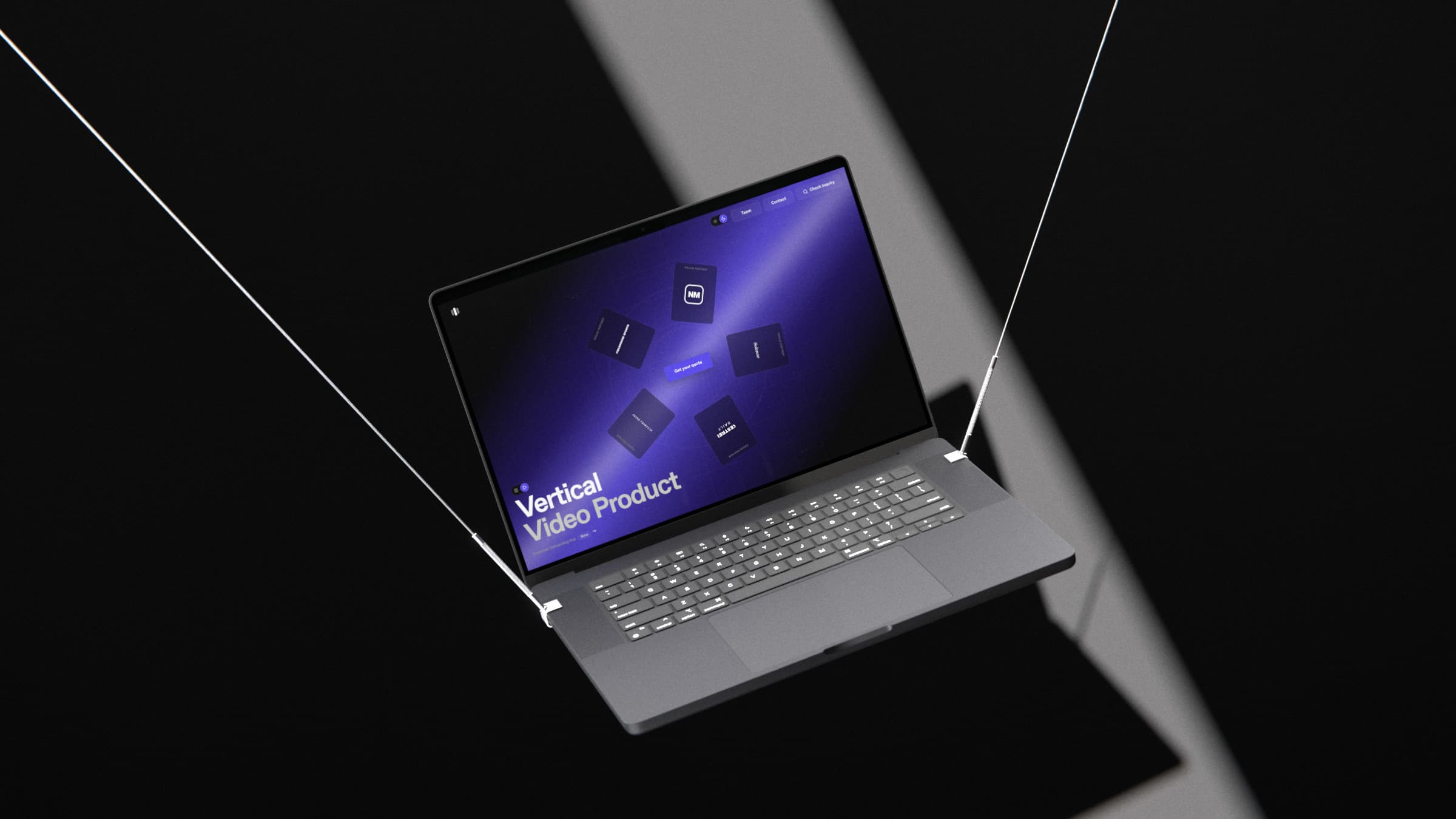
Vertical Video Product
Case Study · Vertical video player
One player, seven publishers:
Turning client designs into builds that ship
The Vertical Video Product is Dailymotion's swipeable video player that publishers embed on their sites.
I led each publisher's custom version from first design to delivery, working with their product, design and development teams across Europe and Australia.
Vertical Video Product · Product Demo
What is the Vertical Video Product?
The product, my role, and the results.
Vertical Video Product
A swipeable vertical video player that publishers embed on their sites. Readers swipe through short videos, and each one can send them to an article. Every publisher gets its own version, in its own look, on web, mobile and desktop.
Project details
Role
Timeline
Team
Platform
Who I worked with
Dailymotion
My team
I was the only designer.
The product manager owned the technical build.
Online meetings
Publishers
Each publisher's team
Product managers, designers, developers and business teams.
I worked with each of them directly.
Enterprises portfolio




Impact
2024–2026
Weeks to delivery
2+ → 1
Early publishers took 2+ weeks. Once the layout library existed, similar-sized ones took about 1.
Live publishers
7
Corriere della Sera, QN, Euronews, Cosmopolitan, Public Sénat, Konbini and Australian Community Media.
Euronews editions
10+
Different countries and languages, on one player.
Monthly views
500k+
All partners combined, from Dailymotion and partners' own analytics.
Publishers designed their own players, and missed what a player needs
Messy client files slowed every delivery.
Each publisher sent a Figma design for its custom version of the player.
Most were not ready to build.
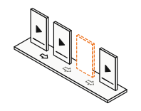
01
Missing frames
No design for some triggers and behaviours.
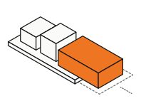
02
Broken auto-layout
Components did not resize.
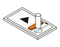
03
Moving targets
The progress bar shifted under the finger as it expanded.
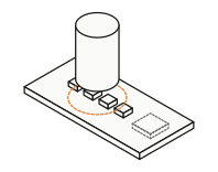
04
Small touch areas
Easy to miss with a finger.

Layouts are indicative only due to NDA.
Root cause
Publishers design pages, not players.
Gestures, states and touch ergonomics were new territory for them.
I studied the apps viewers already use, then tested on real phones
Four platforms benchmarked, six people tested.
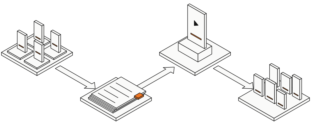
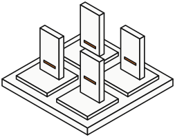
Step 1 / Benchmark 4 platforms
TikTok, YouTube Shorts, Instagram Reels and Facebook Reels: what each does well, what it does badly, and why.
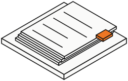
Step 2 / Document what works
I wrote it up as internal documentation, so the developers and I didn't have to guess.
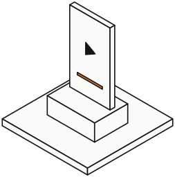
Step 3 / Update the default
Four patterns went into our default player.
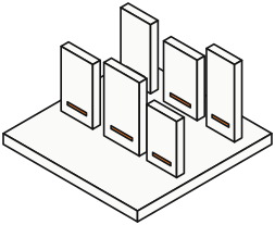
Step 4 / Test on 6 devices
Six people on different phones, to see what breaks in a browser.

Confluence · Illustrative purposes only due to NDA.
Adopted 1
Progress bar position
Where each platform places the bar and keeps it clear of system gestures. This set our default position.
Adopted 2
Progress bar behaviour
How the bar responds to touch and scrubbing, and how it changes between modes.
Adopted 3
Tap flows
Some platforms pause on the first tap. Others show the controls first, and the next tap pauses. I compared the flows and set one default for our player.
Adopted 4
Default states
What shows on screen before anyone touches it, and the spacing around it.
Tested
What broke on the web
Phones cropped the video to keep 9:16, and the progress bar sat in the iOS app-switch swipe. Fixed in Decision 03.
Key insight
Viewers already know how vertical video works. Our job was to match that, then fix what breaks in a browser.
Native apps own the whole screen. A web player shares it with the browser bar and iOS gestures.
Three decisions, and what each one cost
From research, client work and device testing.
Decision 01 · Saying no to my own team
No comments, no social features
Why
My internal team suggested social features, such as comments. I asked the clients. Most wanted comments off, because moderating them is hard. Some wanted the player to send readers to the related article instead.
Decision
A focused player: the video, its progress, and a call to action to the article.
Rejected
A richer, social player.
Trade-off
If a client asks for comments later, there's no community layer ready to offer.
Rejected: comments clients would have to moderate. Shipped: one tap to the article.

Decision 02 · A library of layouts
Layouts clients can pick from, not files to fix
Why
Components differed between clients, but the auto-layouts kept repeating.
Decision
A library of reusable layouts, ready for any client's components. Clients still get any layout they want, built with our layouts and their own spacing rules.
Result
Faster rounds with more examples, and a quicker handover, backed by a matching codebase for layouts and interactions.
Rejected
Fixing each client's file on its own.
Trade-off
Fewer novel structures. Most layouts follow patterns from the benchmark, which viewers already know.
Illustrative purposes only due to NDA.
Default premade layouts. Each publisher uses its own logo, typeface and colours.

Decision 03 · Evidence over habit
Controls stay clear of the phone's edge
Why
The benchmark put the bar at the bottom, as in native apps. Testing showed it sat in the iOS app-switch swipe, worse in fullscreen, and phones cropped the video to keep 9:16.
Decision
A safe area keeps the video centred on any screen. The progress bar stays at the bottom, but moves up when the browser's bottom bar hides. An invisible touch area makes the thin bar easy to scrub.
Rejected
A bar fixed to the bottom edge in every state.
Trade-off
The bar changes position between modes, so the developers and I needed a script to handle it.

I led each publisher from first design to a developer-ready file
Same four steps for every international publisher.
Publishers sent their own design proposals. I took each one over and owned it until handover: its look, interactions and touch ergonomics.
I also owned the strategy for our default player: which features came next, and the goals for each quarter.
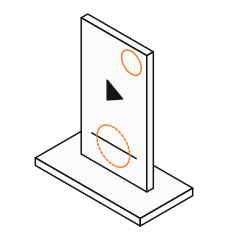
Step 1 / Find the gaps
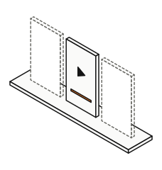
Step 2 / Options + one pick
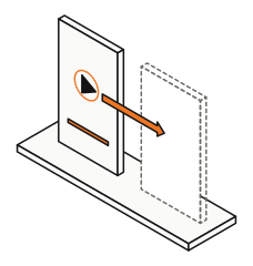
Step 3 / Quick prototypes
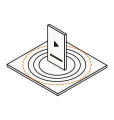
Step 4 / Test, 3–4 rounds
Client feedback 1
They liked seeing options side by side
I kept every round to a few options and one recommendation. It gave them peace of mind to choose.
Client feedback 2
They kept the default design when it fit
I changed only typography and corner radius, through my Figma tokens.
Client feedback 3
They wanted comments off, not on
Moderation is hard. This backed Decision 01.
Specified by me
An interaction script library
I wrote a specification for each behaviour, with its trigger and response. Our developers built them as a script library that matches the layout library.
Beyond design
Loading 3 videos ahead crashed browsers
I proposed a smarter preload approach. The developers built it, and the next video now loads faster.
What I handed over
A player spec developers could build without guessing
Every tap, swipe, hover and error state has a written trigger and response. Each new client starts from the layout library, with proven options instead of a blank file.
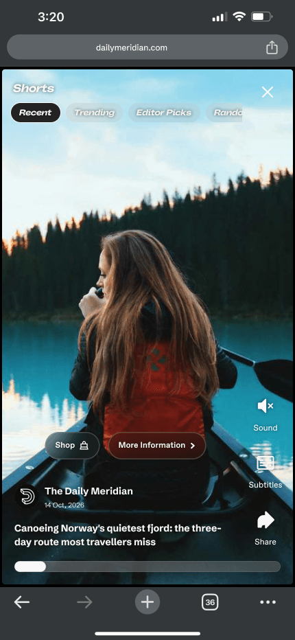
From the handover file · Default player, mobile
Landing · Playing
Paused
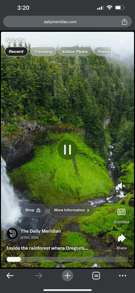
Paused · Subtitles on
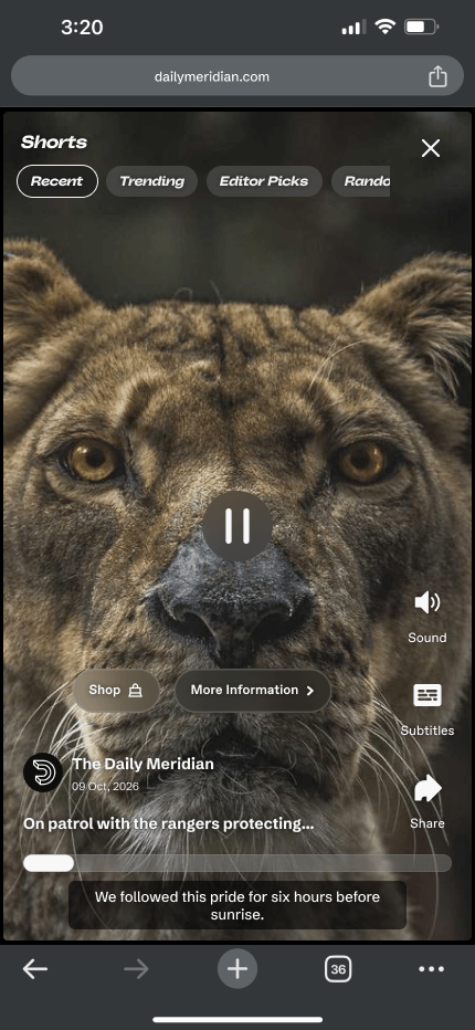
End of video · Swipe hint
CTA rule
Buttons step back after 3 seconds
If the viewer doesn't touch the screen for 3 seconds, the Shop and More information buttons hide. They return for 3 seconds when the video pauses or the next one starts.
Category rule
Unselected categories fade, not vanish
3 seconds after landing, unselected categories fade to 50% over 1 second. A tap or a horizontal scroll brings them back to 100%. When the video pauses, all show at full opacity.
Swipe hint rule
One hint, at the right moment
The swipe-up hint shows only once, when the first video ends and starts to loop. Scrolling or tapping the hint dismisses it.
Key insight
Publishers didn't want a blank canvas.
They wanted a tested default and a clear recommendation.
That insight later became the layout library (Decision 02).
Each publisher gets its own player, without starting from zero
From client files to a shared starting point.
Outcomes
One player, many brands
7 looks
Every publisher runs the player in its own look, built on shared layouts.
Where new clients start
Day one
New clients start from a working default, not a blank file.
Interest beyond news
Sport clubs
Football clubs reached out about players of their own.
What I'd do differently
Start the layout library on day one
I began it after many client files, so my first clients got the slower path. Saving every layout from the first project would have sped up delivery for them too.